promo rants

featured work

search

Entries from January 1, 2010 - January 31, 2010

Sunday
Jan312010

BMW Gina

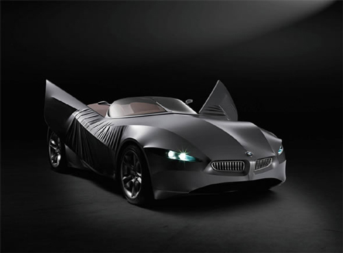
Though I am not a BMW fan, I found the concept of this concept car very interesting.

I'm not sure whether this technology can be applied to all vehicles, or just a full batch of a certain model for that matter, but it surely opens new options to the world of vehicle design. (Am I the only one who finds the "blinking" headlight sockets a bit creepy?)

Thursday
Jan282010

Re-Budget

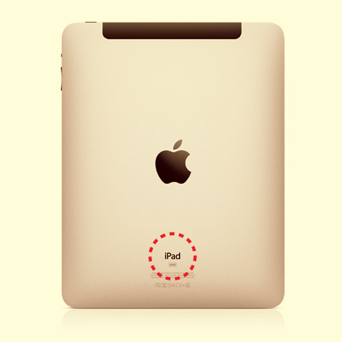
Finally unveiled, and Apple made me feel sick wanting one of these... like, NOW!

It was an adventure with everyone speculating on the name of Apple's large-area-touch-device. iTablet was by far the most annoying. I mean, did Apple ever name something in such a blatantly banal manner? Did they go and name their laptop series iLaptop or iNotebook? Or can you imagine: iMusicPlayer? (I think I barfed in my mouth) 

So, back we go, to the drawing table for the gadget-budget... 

Wednesday
Jan272010

Vanishing Point

Have I mentioned how much I love the Japanese? This video reminds me, once again, why I love them so much...

Amazing video graphics; totally synced with the music (by Cubesato) which is also amazing. The video is created by Takuya Hosogane who has some other amazing work on Vimeo. The quality of these visuals (whether you see them as single frames, or a movie) is beyond impeccable. (A little voice in my graphic-design-infested brain says that "that's how graphic design should look like")

(via ISO50)

Tuesday
Jan262010

The Gatekeeper - New Mini Project

Click on the image above to go to the full project.

Tuesday
Jan262010

Peugeot Alchemy

A few months back I posted something on Peugeot's BB1 over which I'm still drooling. Well, today I am posting this awesome Peugeot ad I found on the internets (I love the internets). The ad is directed by Michael Gracey and the visual effects are by Mikros Image.
More here.

Wednesday
Jan202010

Ampersands Rock!

Recently, I was looking at some ampersands to use in a logo I was fantasizing about making, (given that it's one of those little personal projects of mine, it might never see the light of day), and I realized how much I love it.

The ampersand & (yes, that eight-lookalike symbol everyone's having trouble drawing has a name and a history, which is actually worth reading on wikipedia) always fascinated me because, i) it was always a challenge to draw and, ii) I don't know, I guess the fact a character deriving from two letters, which bears a story and meaning, excites the graphic designer in me. So, imagine my reaction when I found this blog on the SwissMiss blog. 300&65 Ampersands is essentially a daily celebration of the ampersand, one everyday. 

(via)

Tuesday
Jan192010

Thoughts on Avatar

So, last night I finally got to see Avatar in all its 3D glory (though I didn't go crazy over the whole 3D experience), and I will echo whatever good everyone else said about Avatar, but I will also agree with those who said that the plot was somewhat of a cliché. (Pocahontas perhaps?) infused with an overwhelming amount of heroism, selflessness and all that defines an uncorrupted perfect little (alien) world. But hey, as long as everything  looks as good as this did, with all the perfectly conceived and created creatures, landscapes, and Sigourney Weaver still being as awesome as she can be, I don't care: Cliché your heart out...

However, as a graphic designer/typography freak, I was shocked (like many fellow designers) by the totally invalid choice of the typeface Papyrus as the film's identity font. I mean, Papyrus is one of the most frowned-upon fonts amongst designers (along with the awful Comics Sans). I am really baffled as to who decided that Papyrus was a fit choice of a font to have the name/logo of the film set in it, and moreover, who went ahead and OK-ed the idea of setting the subtitles in this font as well. (We had to experience the additional horror of seeing the subtitles set in the Greek form of Papyrus too, given that the subs to Navi where in Greek here.) Here's to hoping that James Cameron will snap out of whatever he's in and kill Papyrus for the Avatar sequel...

Additional thought: Also, why did they have Leona Lewis singing I See You (A.K.A. My Heart Will Go On 2) at the credits? I mean, that was totally off and so foreign to the dynamic and the energy of what we were watching for about three hours... Maybe a hybrid of electronic and organic music would've been more appropriate. Besides, wasn't that the feel of the whole film?

Monday
Jan182010

Parking Lot - New Project

It seems that I got to be creative over the Christmas holidays... Click on the image above to go to the full project. Again, thanks to Christina, Nineta and Andria.

Plus: The embroidery/pearl earrings above (left) and the chain/embroidery necklace (right) are Anna Koumoushi originals.

Sunday
Jan172010

Eri Nobuchika

About a couple of weeks ago, I posted something on Röyksopp after buying their album "Junior". "Vision One" ended up being my favorite off Junior and after noticing that it contained samples from (what it seemed to be) a japanese song I immediately wanted to find out more.

So (of course) I googled names and track names and came up with the video below, which is the original version of "Vision One" in japanese, titled "Sing A Song" by Eri Nobuchika. Being a confessed fan of the japanese pop culture (though, I have to confess that I have fallen a bit behind on my updates) I was exited to see that Eri Nobuchika is a singer/songwriter born in 1985 and is very respected and popular in the circles of the japanese pop/dance/house music scene. She has recently released an album called "Hands", which sort of deviates from the electonic/house sound. Anyhow, I still remain curious enough to explore her (previous) releases.

Saturday
Jan162010

Cote Et Ciel Rucksack

I had fallen in love with this rucksack from Cote Et Ciel (I even love the term rucksack) last fall, and I got mine two days ago through UPS (probably the only courier that makes us feel less cut off from the rest of the world).

First of all; it's absolutely gorgeous. The gray material which looks like gray jersey (which I also tend to like a lot) is in fact a thicker sturdier fabric consisting of recycled water bottles (!!). To make a long story short: it has a separate part for laptops up to 15" and all the necessary cables, mice, wires, etc. The front "compartment" is very spacious, zips-open vertically. When zipped-closed, it folds and secures on one side. See more images and info here.