promo rants

featured work

search

Entries in Typography (19)

Monday
Apr162012

Avant Garde Press: Redesigned (a while back)


Last summer, two of the most inspiring and admired fellow designers/friends; Christina and Myria and myself, took over the redesign of an independent free press publication. For this we formed a little design alliance called mychart

About the publication: Avant Garde is a free press publication which elaborates on stories related, but not limited just, to arts, culture, fashion, design and matters that affect, or are part of, the contemporary reality of the island.

On the new design: Departing from the initial use of the term Avant Garde, which derives from vanguard: the very front line of military formations during operations, we created the new identity of the publication. With references to military semiotics and by graphically distorting or exaggerating, if you like,  the strictness and order found in the military visual world, we created the new brand/identity of the publication. Along with this new identity, we created a series of icons and gimmicks that correspond to the categories, themes and stories in the publication and which work with clean and "sturdy" typographical treatments. 

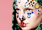
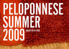
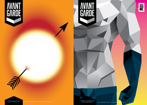
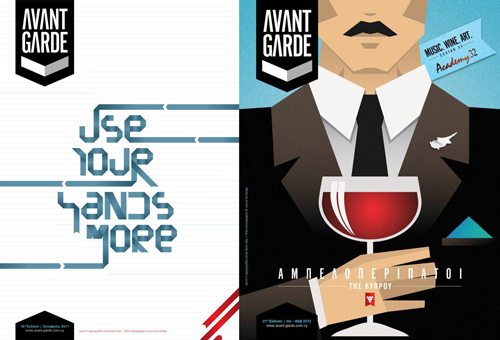
The covers: As the new design team of AG, we were assigned the first three covers of the revamped version. Each month a guest, or invited designer creates the cover and people are also free to submit ideas, so anyone interested can mail their ideas over at the AG website. The first re-installment  of AG came this past August, with a "Summer Love" overall theme (Can't you feel the heat?), and for this issue's cover Christina was called to the task. The second redesigned issue was Superhero-themed and I was the designated cover designer this time. I usually block when I am asked to render something that's vast and vague at the same time; and though I had something very Roy Lichtenstein in mind, I decided to deviate my initial thought (something that doesn't happen very often) and go with… well, what I went with. Have I mentioned that I really love superheroes? Then for the third redesigned issue Myria went with a very hand-made feel for her cover, with all the trimmings and an awesome custom made font. From there on our guest designers took over. Last January I designed the cover for the Wine Routes of Cyprus issue which stood as an impulsively interactive cover

All the issues are available for online reading at the AG website, (the publication is in Greek).

Monday
Dec052011

Lana Del Rey Album Cover

I know that the previous (from over a week ago) post was a Lana Del Rey post, but I just could not NOT post on this. This is the cover for Lana Del Rey's upcoming album (end of January) and it is pure perfection. Impeccable in every possible way. 

Monday
Jun062011

Linotype: The Film 

This post might not "touch" everyone, but the typographically aware and design aficionados will definitely feel a certain warmth. 

Linotype: The Film is a documentary film about the Linotype casting machine. The Linotype casting machine revolutionized printing and communication at a time when the process of casting and printing text was a manual and time-consuming procedure. What the Linotype essentially did, was to set a full line of type (Line o' Type) instead of having it done by hand, character by character (or matrix by matrix in this case). 

I remember trying to manually set a body of text when I was college and I found it extremely hard, frustrating and stressful. So, I can imagine (and I envy) the enthusiasm and admiration these people bear for the Linotype. I mean, if something came along and took away a painfully dreadful procedure of my work (hello, quotations and invoicing) I would worship it the exact same way, if not more.

Wednesday
Mar022011

Typophile's Scrabble

To be honest, I never was a huge fan of Scrabble until I started playing a version of it on the iPhone. Now I must have about 5 ongoing games... I am also reminded of what a sore loser I am... When I lose, that is.

Now if only this was real and available to purchase... Unfortunately it's a concept version of the word game by Andrew Clifford Capener and I am sure that I'm not the only one out there who's wanting lusting over this.

(via)

Wednesday
Feb162011

Live The Language

As a person who lived for a while in a foreign country and had to use a new language to survive, I was immediately drawn to these promo videos for Education First (EF). I am referring to my time in Italy, not the States. Adjusting to the States when I went there was not as hard, compared to the terror I experienced in Milan and the severe linguistic barriers I had to overcome as soon as possible. 

Gustav Johansson was commissioned to direct these gorgeous videos for EF. Live The Language is a series of four videos focusing on London, Paris, Barcelona and Beijing which depict the magic of the first encounter with a new place and a totally new language.

The kinetic typography and the beyond-words-amazing usage of brilliant typefaces, by Albin Holqvist, make these videos love-at-first-sight material for any typography-sensitive (or plain sensitive) person out there.

(via) (all videos in the post)

Barcelona

**There's more inside the post**

Friday
Sep172010

Making Future Magic

Japanese advertising agency Dentsu asked London-based interface design agency BERG to creatively deliver the role of screens in our lives. BERG went ahead and created this amazing time-lapse photography/video project with amazing 3D typography. I'm not even going to try to explain how they did it, everything is beautifully explained in the embedded video right before Making Future Magic begins.

(via)

Wednesday
Sep082010

Moshun: An Animated Typeface

I love print, I really really do love print. I also love adore typography, the stillness, movement and expression of any possible emotion that an adequate typographer can achieve with mere typefaces. Now this comes to stir everything we, the designers and the rest of the people,  know.

Animated typefaces! Well, it was bound to happen at some point; iPads, tablets, animated webpages etc. This one, named Moshun (motion) and created by Calango based in The Netherlands, is some serious (moving) eye-candy! I should really dust off that stale and moldy knowledge I once had of After Effects if I want to dig into this. 

(via)

Wednesday
Jan202010

Ampersands Rock!

Recently, I was looking at some ampersands to use in a logo I was fantasizing about making, (given that it's one of those little personal projects of mine, it might never see the light of day), and I realized how much I love it.

The ampersand & (yes, that eight-lookalike symbol everyone's having trouble drawing has a name and a history, which is actually worth reading on wikipedia) always fascinated me because, i) it was always a challenge to draw and, ii) I don't know, I guess the fact a character deriving from two letters, which bears a story and meaning, excites the graphic designer in me. So, imagine my reaction when I found this blog on the SwissMiss blog. 300&65 Ampersands is essentially a daily celebration of the ampersand, one everyday. 

(via)

Wednesday
Dec162009

An Apple A Day Calendar

Ok, first of all, it's calendar, and never calender... (I just get annoyed when I see that mistake).

This gorgeous letterpress calendar wants to keep you healthy; it encourages you to eat an apple a day, and use the stickers on it to mark the days gone on the calendar. 

You can get one here.

Monday
Nov302009

Anamorphic Helvetica

More info here.

(via)