promo rants

featured work

search

Entries in Design (36)

Monday
Apr162012

Avant Garde Press: Redesigned (a while back)


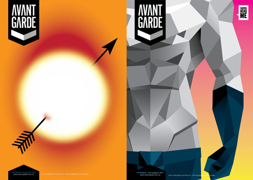
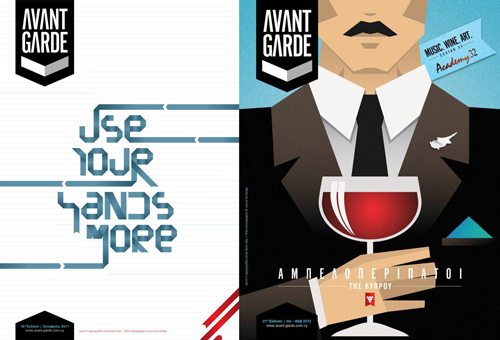
Last summer, two of the most inspiring and admired fellow designers/friends; Christina and Myria and myself, took over the redesign of an independent free press publication. For this we formed a little design alliance called mychart

About the publication: Avant Garde is a free press publication which elaborates on stories related, but not limited just, to arts, culture, fashion, design and matters that affect, or are part of, the contemporary reality of the island.

On the new design: Departing from the initial use of the term Avant Garde, which derives from vanguard: the very front line of military formations during operations, we created the new identity of the publication. With references to military semiotics and by graphically distorting or exaggerating, if you like,  the strictness and order found in the military visual world, we created the new brand/identity of the publication. Along with this new identity, we created a series of icons and gimmicks that correspond to the categories, themes and stories in the publication and which work with clean and "sturdy" typographical treatments. 

The covers: As the new design team of AG, we were assigned the first three covers of the revamped version. Each month a guest, or invited designer creates the cover and people are also free to submit ideas, so anyone interested can mail their ideas over at the AG website. The first re-installment  of AG came this past August, with a "Summer Love" overall theme (Can't you feel the heat?), and for this issue's cover Christina was called to the task. The second redesigned issue was Superhero-themed and I was the designated cover designer this time. I usually block when I am asked to render something that's vast and vague at the same time; and though I had something very Roy Lichtenstein in mind, I decided to deviate my initial thought (something that doesn't happen very often) and go with… well, what I went with. Have I mentioned that I really love superheroes? Then for the third redesigned issue Myria went with a very hand-made feel for her cover, with all the trimmings and an awesome custom made font. From there on our guest designers took over. Last January I designed the cover for the Wine Routes of Cyprus issue which stood as an impulsively interactive cover

All the issues are available for online reading at the AG website, (the publication is in Greek).
Friday
Mar232012

Food Icons

Julian Burford, a Netherlands-based graphic designer has created a series of eight perfect food icons for an upcoming iPhone app. These look so good, you want to eat them and that's not an easy thing to achieve. Those who tried to render or design food know how hard it is to make something look remotely appetizing.

I remember trying to make a hand-drawn Snickers bar look edible back in College, sans Photoshop. Don't even get me started on trying to illustrate milk.

(via)

Sunday
Mar042012

The Weather Is Beautiful...

Over the past few weeks, I've been crazy busy working -among a myriad of other things- on one of the publications I'm art directing under the umbrella of IPWT. It's an English-Russian publication based here in Cyprus and this time around (the 4th Issue, to be precise) Status Magazine, focused on the various aspects and faces of spring. 

The above composition is what will adorn the cover of this issue. Despite my feelings towards the blatantly banal topic of flowers, my latest "friction" with the concept of floral prints and patterns made the creation of the above kaleidoscope-oid illustration a great experimentation with flower forms.

I should be posting the covers and layouts of Status Magazine on the IPWT website really soon.

"The weather is beautiful, wish you were here."

Saturday
Sep102011

"Martha Marcy May Marlene" Movie Poster

"Martha Marcy May Marlene" is a movie I probably won't be able to see in theaters here. I'm not sure when I'll finally see it, but I'm sure it will be one of those intense emotion-inducing films, of the likes of "The Virgin Suicides" only a bit harsher, I guess, and from what I read. (Dare I say: Finally, an Olsen sister with talent!)

Anyway, the reason I decided to post about this film is the above brilliantly designed poster.

More information on the film and a trailer here.

Sunday
Aug072011

Hard Graft Phone Fold Wallet

© Hard Graft

I remember when Hard Graft first started. Back then they were named Working Class Heroes (I really love that name) and I was drooling over one of their unfold bags. I still am drooling over their handmade bags but I was excited to discover their Phone Fold Wallet a few months back. 

Well, this week I finally ordered one and got is just a couple of days later. Their tagline very simply states: "You lose what you don't hold" and I know my iPhone would definitely be lost (for good) if I kept dropping it. 

Now, I am seriously lusting over (and need to start saving for) their 2Unfold Laptop Bag, while I am impressed by the engineering in their design for the 3Fold Multi-Use Bag

© Hard Graft

Wednesday
Jun082011

Vitsœ

Vitsœ is a furniture manufacturer for the past 50 years. Timelessly designed by Dieter Rams.

Monday
Jun062011

Linotype: The Film 

This post might not "touch" everyone, but the typographically aware and design aficionados will definitely feel a certain warmth. 

Linotype: The Film is a documentary film about the Linotype casting machine. The Linotype casting machine revolutionized printing and communication at a time when the process of casting and printing text was a manual and time-consuming procedure. What the Linotype essentially did, was to set a full line of type (Line o' Type) instead of having it done by hand, character by character (or matrix by matrix in this case). 

I remember trying to manually set a body of text when I was college and I found it extremely hard, frustrating and stressful. So, I can imagine (and I envy) the enthusiasm and admiration these people bear for the Linotype. I mean, if something came along and took away a painfully dreadful procedure of my work (hello, quotations and invoicing) I would worship it the exact same way, if not more.

Friday
Apr222011

Instantly Lusted

There's this preconception about VW Beetles here, at least the New Beetles introduced to the market in 1998, that they're just for women. Maybe it is, maybe people are just stupid to think so, but I think the 2012 model shatters that preconception.

I love how they redesigned and refined this classic into what seems to be a new classic, added some sharpened edges suggesting a more masculine, more sports car culture side of the Beetle. It's official, I want one.

Is it me, or is the way VW updates their designs sort of reminiscent of the redesign approach Apple has on their product line... afterall, there was this rumor going around about the VW+Apple-powered iCar.

Saturday
Mar122011

Double Feature (B. Traubeck/Lux Repeat)

Traubeck's PRINCE x OBAMA Shirts

Bartholomäus Traubeck, is a graphic designer/video installation artist who's keeping very very busy, telling from all the things he does. Traubeck has a lot going on: A shirt brand by the name Prince x Obama, a furniture/product design division called  Rhythm, a visual sketchbook and he creates awesome videos and graphics.

from the Avoiding You video

One of his latest videos is an absolutely gorgeous video (at the end of this post) for the Italian, Merano-based electro band Lux Repeat. For this video, Traubeck used Google Earth visuals along with graphics reminiscent of 80s ambitious sci-fi movies. The usage of pixelated and loading overfly snippets from Google Earth is just so appropriate and fitting to this great track by Lux Repeat.

Now the music: Judging from their EP Passing The Light Barrier, I humbly believe that Lux Repeat (a.k.a Martin Retter) is one of those slowly emerging electro acts which have more soul and oomph in their work than most of the "big names" in the electro scene out there. (Plus, I have a soft spot for Italy, so this makes it easier for me to like.) The Lux Repeat latest EP is available to download here once you pay with a Tweet or Facebook status. 

(via)

Thursday
Feb242011

Coca Cola + Daft Punk

I just love collaborations, especially when these occur between different genres and disciplines.

So, Coca Cola worked with Daft Punk on the design of these new Coke bottles. The silver and gold mimic the colors of the helmets donned by the electro duo. So it's been a busy period for Daft Punk: the collaboration with Disney on the soundtrack of Tron Legacy, now another super-high profile collaboration with Coca Cola, who's next? Hello? Nike, Adidas are you listening? (That would be awesome actually!)

The bottles will start rolling out in March 2011. They will be released in clubs around the world and will be exclusively available at Colette Paris as a collectible box set

(via)